You are here
Candlesticks Price Bars
Candlestick charts are much more visually appealing than a standard two-dimensional bar chart. As in a standard bar chart, there are four elements necessary to construct a candlestick price bar: the open, high, low, and closing price for a given time period. Here are examples of candlesticks with definitions for each candlestick component:
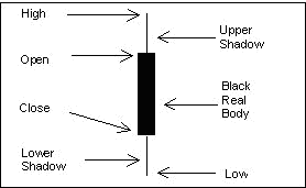
The body of the candlestick is called the real body, and represents the range between the open and closing prices.
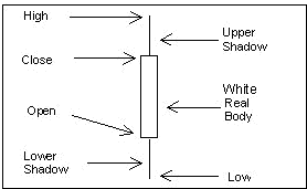
A black or filled-in body represents that the close during that time period was lower than the open, (normally considered bearish) and when the body is open or white, that means the close was higher than the open (normally considered bullish).
The thin vertical line above and/or below the real body is called the upper/lower shadow, representing the high/low price extremes for the period.
Bar Compared to Candlestick Charts
Below is an example of the same price data conveyed in a standard bar chart and a candlestick chart. Notice how the candlestick chart appears 3 dimensional, as price data almost jumps out at you.
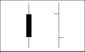
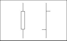
The long, dark, filled-in real bodies represent a weak (bearish) close, while a long open, light-colored real body represents a strong (bullish) close. It is important to note that Japanese candlestick analysts traditionally view the open and closing prices as the most critical of the day. At a glance, notice how much easier it is with candlesticks to determine if the closing price was higher or lower than the opening price.