Overlays are shown directly on the chart.
To display an Overlay Indicator, right-click the Chart Window and select Chart Overlays. Select the name of the Overlay Indicator that you would like to view from the drop-down menu. A checkmark will appear next to any indicators you have selected and all selected indicators will show directly on your chart, not in the indicator window. To remove an overlay indicator from your chart, click on the indicator in the drop-down menu again and the checkmark with disappear.
The Overlays that come from plug-ins are listed at the top of the menu, these are further discussed in the Plug-Ins section of this manual.
Overlay Preferences (Quick Links)
In the bottom right of the chart, you will see symbols that will correlate with which Overlays you have selected. If you click these symbols the control panel will switch to the preferences tab automatically with the preferences of that overlay displayed. These symbols abbreviations are included in the title of the Overlays in the manual with parenthesis.
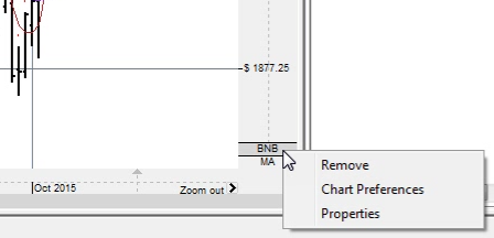
You may right-click the abbreviated names to Remove the overlay, open Chart Preferences or view Properties for that overlay.
You can also navigate to the preferences of each overlay by right-clicking on the chart and go to Overlay Preferences and selecting the appropriate Overlay.
On Screen Text
When you open an overlay you will see text appear on your chart in the upper left-hand corner. You can choose whether to show this text, and choose where it appears by right-clicking on your chart. Mouse over On Screen Text to view your options. This also changes how indicator on-screen text is displayed.
The Overlays are explained in detail in the following sections:
The Advantage Lines chart overlay is part of the Bulls 'n Bears Advantage Plug-in.
For more information, view the Advantage Lines manual page in the Bulls 'n Bears Advantage Plug-in section [1].
The Bulls 'n Bears, Red Green Light chart overlay is part of the Bulls 'n Bears Advantage Plug-in.
For more information, view the Bulls 'n Bears, Red Green Light manual page in the Bulls 'n Bears Advantage Plug-in section [2].
The Candlestick Auto-Recognition chart overlay is part of the Candlestick Auto-Recognition Plug-in.
For more information, view the Candlestick Auto-Recognition manual page in the Candlestick Auto-Recognition Plug-in section [3].
The Historical Averages chart overlay is part of the Seasonals Plug-in.
For more information, view the Historical Averages manual page in the Seasonals Plug-in section [4].
The Ribbon chart overlay is part of the Bulls 'n Bears Advantage Plug-in.
For more information, view the Ribbon manual page in the Bulls 'n Bears Advantage Plug-in section [5].
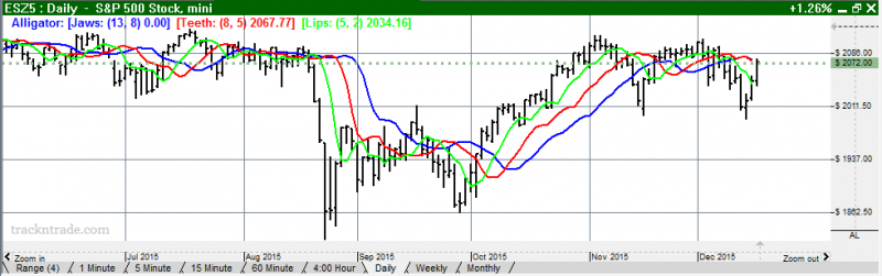
A unique use of fractal geometry and nonlinear dynamics is used to create the method of calculations for the Alligator Indicator. Used in combination with the Gator Indicator, the Alligator has proved to be effective at pinpointing large market trends.
Components
Alligator’s Jaw (blue line): The Balance Line for the timeframe that was used to build the chart (13 period Smoothed Moving Average, moved into the future by 8 bars).
Alligator’s Teeth (red line): The Balance Line for the value timeframe of one level lower (8 period Smoothed Moving Average, moved by 5 bars into the future).
Alligator’s Lips (green line): The Balance Line for the value timeframe, one more level lower (5 period Smoothed Moving Average, moved by 3 bars into the future).
The Lips, Teeth, and Jaw of the Alligator show the interaction of different time periods. As clear trends can be seen only 15 to 30 percent of the time, it is essential to follow them and refrain from working on markets that fluctuate only within certain price periods.
When the Jaw, Teeth, and Lips are closed or intertwined, the Alligator is going to sleep or is asleep already. As it sleeps, it gets hungrier and hungrier: the longer it sleeps, the hungrier it will be when it wakes up. The first thing it does after it wakes up is to open its mouth and yawn. Then the smell of food comes to its nostrils: flesh of a bull or flesh of a bear, and the Alligator starts to hunt it. Having eaten enough to feel quite full, the Alligator starts to lose interest in the food/price (Balance Lines join together), and this is the time to fix the profit.
Alligator Example:
To open the Alligator Preferences click on the QuickLink (AL) in the lower right of the chart. Or you can right-click, select Overlay Properties and then Alligator. If you click on the chart, the Preferences tab will go back to chart settings.
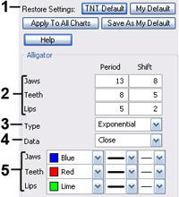 1. Restore Settings: TNT Default will change your settings back to the original software settings. My Default will change current settings to your personalized default settings. Apply To All Charts will apply your selected settings on all open charts. Save As My Default will save your current personal settings.
2. Jaws, Teeth, Lips: Specify your periods and shift specifications.
3. Type: Select Simple, Linear Weight, or Exponential.
4. Data: Select Open, High, Low, or Close.
5. Jaws, Teeth, Lips: Choose the color, line style, and line thickness of your indicator line.
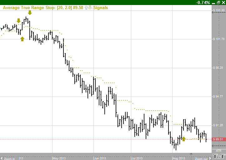
Average True Range Stop ("ATR") is a modified version of the Average True Range [6] indicator that was developed by Welles Wilder to work with the commodity industry. The purpose of the Average True Range indicator is to recognize the level of volatility in a market. The system was subsequently modified for trailing stops and now is commonly known as Average True Range Trailing Stop.
Calculation
Average True Range Stop starts with Average True Range indicator calculations with a stop factor applied to it. The ATR indicator is calculated with a default period of 20 days. The ATR indicator is a moving average of the True Ranges defined below and is calculated based on the largest of the three:
Today’s HIGH to today’s LOW
Yesterday’s CLOSE to today’s HIGH
Yesterday’s CLOSE to today’s LOW
Now to calculate the stop part of the indicator we apply a stop factor to the result of the ATR indicator and add/subtract the value from the close:
close +/- (ATR value) * (stop factor)
Add or subtract (+/-) depends on whether it is trailing a buy or sell stop respectively. Know that since the value is meant to be trailing, the value will not move away from the current market price. That means if the calculation yields value that is farther away from the market then it is ignored.
Example of the Average True Range Stop
Preferences
To open the Average True Range Preferences click on the QuickLink (ATR) in the lower right of the chart. Or you can right-click, select Overlay Properties and then Average True Range. If you click on the chart, the Preferences tab will go back to chart settings.
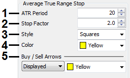 1. Period: Specify the number of days to be used in calculating the ATR.
2. Stop Factor: This variable determines how close or how far the stop follows the market. Larger values mean that the stop will move farther away from the market and smaller values mean that the stop will move tighter to the market.
3. Style: Choose how you would like the indicator displayed. Select squares, crosses, dots, or lines.
4. Color: Select the color for the indicator which indicates where to place the stop.
5. Buy/Sell Arrows: Turns the display for buy/sell arrows on and off. You also have the option to change the color of the buy/sell arrows.
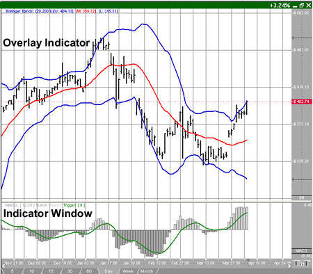
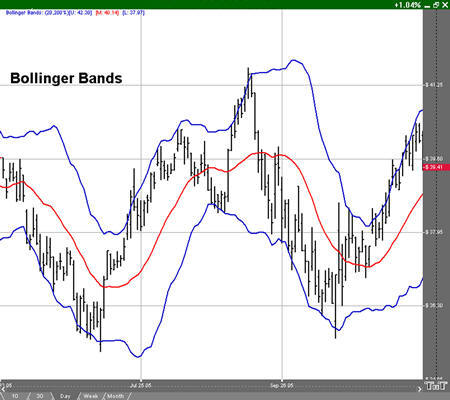
John Bollinger created Bollinger Bands in an effort to gauge the volatility and condition of a market. These bands are used to determine the trading range and give an indication of when to buy and when to sell. Bollinger Bands are also used to indicate market volatility, the wider the bands the greater the volatility. Inversely, the narrower the bands, the lesser the volatility. By plotting two lines at an interval around a moving average, Bollinger bands give a good indication of market conditions and price relation. The moving average which the band is based on works as an indicator to confirm trade signals.
Calculate the moving average with this formula:
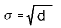
Subtract the moving average from each of the individual data points used in the moving average calculation. This gives you a list of deviations from the average. Square each deviation and add them all together. Divide this sum by the number of periods you selected.

Take the square root of d. This gives you the standard deviation.
Compute the bands by using the following formulas:
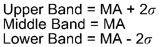
Pn: The price you pay for the nth interval.
n: The number of periods you select.
A buy signal occurs when a chart bottom is below the lower band followed by a bottom above the lower band. A sell signal occurs when a chart top is above the uppermost band followed by another top that is below the upper band.
Example of Bollinger Bands
To open the Bollinger Bands Preferences click on the QuickLink (BB) in the lower right of the chart. Or you can right-click, select Overlay Properties and then Bollinger Bands. If you click on the chart, the Preferences tab will go back to chart settings.
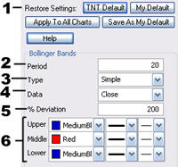 1. Restore Settings: TNT Default will change your settings back to the original software settings. My Default will change current settings to your personalized default settings. Apply To All Charts will apply your selected settings on all open charts. Save As My Default will save your current personal settings.
2. Period: To specify the number of days used in calculating the indicator, click in the box, highlight the number, and type in a new value.
3. Type: Change the type of the Moving Average line to simple, linear weight, or extra smoothed.
4. Data: Choose either open, high, low, or close as the data used in calculating the moving average.
5. % Deviation: Defines the displacement between the Bollinger Bands. Click in the box, highlight the number and type a new value to change the displacement.
6. Upper, Middle and Lower Band Lines: Change the color, line style, and line thickness of the Bollinger Bands.
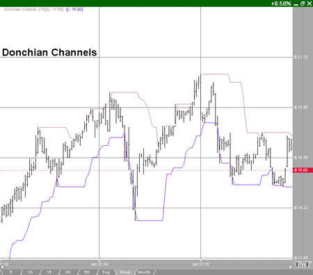
Donchian Channels were created by Richard Donchian, an expert in trends. The DON is a simple trend breakout system. The channel works well in trending markets, but not as well in sideways moving markets.
Donchian Channels measure volatility by creating two bands based on the highest high and lowest low for a specified period. Many traders view the market crossing above the upper band as a signal to buy and the market crossing below the lower band as a signal to sell.
The calculation of the DON is here:
Donchian Channel High = MAX (HI, n)
Donchian Channel Low = MAX (LO, n)
n: The number of periods you select.
To open the Donchian Channel Preferences click on the QuickLink (DON) in the lower right of the chart. Or you can right-click, select Overlay Properties and then Donchian Channels. If you click on the chart, the Preferences tab will go back to chart settings.
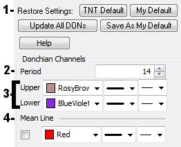
1. Restore Settings: TNT Default will change your settings back to the original software settings. My Default will change current settings to your personalized default settings. Apply To All Charts will apply your selected settings on all open charts. Save As My Default will save your current personal settings.
2. Donchian Period: Specify the number of bars in a period.
3. Upper, Lower: Choose the color, line style, and line thickness of your indicator line. Upper is the line formed by the highest high in the period specified. Lower is the line formed by the lowest low in the period specified.
4. Mean Line: Graph a line that is the midpoint between the upper and lower.
Quick Description
Ichimoku Kinko Hyo is a purpose-built trend trading charting system that has been successfully used in nearly every tradeable market. It is unique in many ways, but its primary strength is its use of multiple data points to give the trader a deeper, more comprehensive view of price action. This deeper view, and the fact that Ichimoku is a very visual system, enables the trader to quickly discern and filter "at a glance" the low probability trading setups from those of higher probability.
History
The charting system of Ichimoku Kinko Hyo was developed by a Japanese newspaper man named Goichi Hosoda. He began developing this system before World War II with the help of numerous students that he hired to run through the optimum formulas and scenarios - analogous to how we would use computer simulated backtesting today to test a trading system. The system itself was finally released to the public in 1968, after more than twenty years of testing, when Mr. Hosoda published his book which included the final version of the system. Ichimoku Kinko Hyo has been used extensively in Asian trading rooms since Hosoda published his book and has been used successfully to trade currencies, commodities, futures, and stocks. Even with such wild popularity in Asia, Ichimoku did not make its appearance in the West until the 1990s and then, due to the utter lack of information in English on how to use it, it was mostly relegated to the category of another "exotic"
indicator by the general trading public. Only now, in the early 21st century, are western traders really beginning to understand the power of this charting system.
Equilibrium at a Glance
The name Ichimoku Kinko Hyo, which translates to "Equilibrium chart at a glance" aptly describes the system and how it is to be used, as described below:
• While Ichimoku utilizes five separate lines or components, they are not to be used individually when making trading decisions. Instead, they should be used together to form an integrated "whole" picture of price action that can be gleaned "at a glance". Thus, a simple look at an Ichimoku chart should provide the Ichimoku practitioner with a nearly immediate understanding of sentiment, momentum, and strength of the trend.
• Price action is constantly measured or gauged from the perspective of whether it is in relative equilibrium or disequilibrium. Hosoda strongly believed that the market was a direct reflection of
human group dynamics or behavior. He felt that human behavior could be described in terms of a constant cyclical movement both away from and back towards equilibrium in their lives and
interactions. Each of the five components that make up Ichimoku provide its own reflection of this equilibrium or balance.
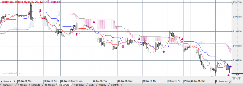
Example:
Preferences:
To open the Ichimoku Kinko Hyo Preferences click on the QuickLink (IKH) in the lower right of the chart. Or you can right-click, select Overlay Properties and then Ichimoku Kinko Hyo. If you click on the chart, the Preferences tab will go back to chart settings.
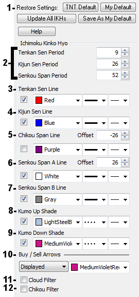
1. Restore Settings: TNT Default will change your settings back to the original software settings. My Default will change current settings to your personalized default settings. Apply To All Charts will apply your selected settings on all open charts. Save As My Default will save your current personal settings.
2. Periods: These are the periods defined for the Tenkan Sen Line, the Kijun Sen Line, and the Senkou Span Line. These are the period over which an average of the high and low are calculated.
3. Tenkan Sen Line (Conversion Line): With the default Period this is simply (9-period high + 9-period low)/2. In a daily chart, it is an average of the 9-day high and 9-day low.
4. Kijun Sen Line (Base Line): This is the same as the Tenkan Sen Line but with a 26 day period (using a daily chart and default values).
5. Chikou Span Line (Lagging Span): This is a graph of the closing price plotted at the Offset specified. On a daily chart using the default, it would draw the current close 26 days back. It should be noted that this does not include the current day's bar, as it does not have a closing price.
6. Senkou Span A Line (Leading Span A): This is the midpoint between the Tenkan Sen Line and the Kijun Sen Line plotted at the Offset specified. With the default, it would be plotted 26 days ahead.
7. Senkou Span B Line (Leading Span B): This is also like the Tenkan Sen Line but with a 52 day period (using a daily chart and default values).
8. Kumo (Cloud) Up Shade: This is the area between the Senkou Span Lines when the Senkou Span A Line is above the Senkou Span B Line. The Trend is up when prices are above the Kumo Shading area and strengthened when the Kumo Shading is an Up Shade.
9. Kumo (Cloud) Down Shade: This is the area between the Senkou Span Lines when the Senkou Span B Line is above the Senkou Span A Line. The Trend is down when prices are below the Kumo Shading area and strengthened when the Kumo Shading is a Down Shade.
10. Buy/Sell Arrows: Toggle Buy/Sell Signals to be displayed or not. Buy signals are generated if the Tenkan Sen Line Passes from below or equal to the Kijun Sen Line to above it. Sell signals are generated if the Tenkan Sen Line Passes from above or equal to the Kijun Sen Line to below it.
11. Cloud Filter: This will filter buy signals out that Tenkan Sen Line is equal or greater than then the cloud lines ( the Senkou Span A and B Lines). And then also filter out sell signals out that Tenkan Sen Line is equal or less than then the cloud lines.
12. Chikou Filter: This will filter buy signals out where the current close is greater than or equal to close from (Chikou Span Lino Offset value) periods ago. And then filter out sell signal where the current close is less than or equal to close from (Chikou Span Line Offset value) periods ago.
You can see this by turning on the Chikou Span line which is a close price bar type shifted the defined period (Offset). Then compare the Chikou Span line at the offset value defined to the close price of the market there.
So for Example: on a daily chart with Chikou Filter on, and the Chikou span line is shown with an offset of -26. If the Chikou Span line shown at 26 days ago, which is the last bar's close, is greater than the close of the bar 26 bars ago, it will not display the buy signal.
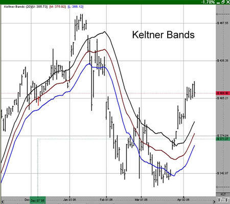
The middle line (20 period EMA) in a rising market should provide support. In a falling market, the middle line should provide resistance. Keltner Bands, as with any moving average indicator, seem to work great in strongly trending markets, but not so well in sideways markets. Just like all trend-following systems, the Keltner Bands are not meant to spot tops or bottoms. Use the Keltner Bands in conjunction with other indicators such as RSI or MACD. Using it in combination with either of these will help provide verification of the strength of a market.
The calculation for the top, or Plus Band, is here:
2 (ATR over 10 periods) + (20 period exponential moving average)
The calculation for the bottom, or Minus Band, is here:
2 (ATR over 10 periods) - (20 period exponential moving average
To open the Keltner Bands Preferences click on the QuickLink (KLT) in the lower right of the chart. Or you can right-click, select Overlay Properties and then Keltner Bands. If you click on the chart, the Preferences tab will go back to chart settings.
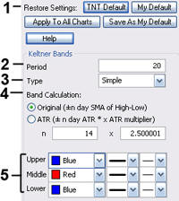 1. Restore Settings: TNT Default will change your settings back to the original software settings. My Default will change current settings to your personalized default settings. Apply To All Charts will apply your selected settings on all open charts. Save As My Default will save your current personal settings.
2. Period: Specify the number of days used.
3. Type: Select Simple, Linear Weight, or Exponential.
4. Band Calculation: Select Original or ATR and enter values of your own.
5. Upper, Middle, Lower: Choose the color, line style, and line thickness of your indicator line.
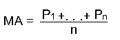
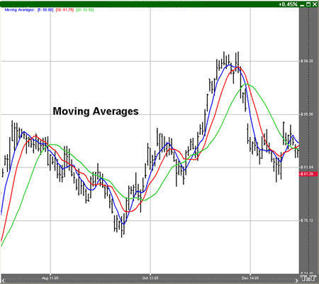
The moving average, or simple moving average, represents the average of the last several closing prices. The moving average is simple to compute, easy to understand, and reliable under tests. This simplicity is the strength of the moving average.
The basic moving average is computed the same as any other mathematical average. The most common way of determining the moving average of a market is to take the closing price over a certain number of days, add them together, and divide by the select number of days.
Moving averages are generally thought to be indicators of a trend. For example, conventional interpretation is that once prices cross from below the moving average to above it, the trend is considered up. On the other hand, if prices go from above the moving average to below it, the trend of the market is considered down.
The purpose of the simple moving average is to track the progress of the trend. Moving averages can potentially keep you in the trend for a long time. The moving average gives you an indication of the trend being up (prices above the moving average) or down (below the moving average). However, the moving average gives you no indication of the length or duration of the trend.
Double moving averages use two different averages in tandem. The first average is generally a faster reacting average using a shorter period of time, usually 10 days. The second average is a slower reacting average that will indicate longer-term price movement.
Using these two averages together helps to alleviate whipsaws by giving a basis of comparison. The faster average breaking above the slower average is a buy signal, the faster average breaking below the slower average is a sell signal.
When using two different moving averages the trader gets a clearer picture of price indications. By combining a slower moving 20-day average, with a quicker reacting 10-day average, you can see where the long-term indications are going.
You would sell once the faster moving average crosses below the slower trend because that’s an indication of a change in trend. Near-term prices should be rising at a greater rate than longer-term prices in a good upward trending market, and vice versa for a downtrend.
The system of triple moving averages is employed by plotting three different moving averages together. The first of these averages is a faster average that only looks at the short-term price direction. The second average is a medium average that reacts to a longer period of time, but not as long as the final average. The third average is the slowest to react because it takes an average of the longest period of time.
A 10, 20, and 40-day moving average system would be considered a triple moving average. The first average, the 10-day, is the quickest to move when prices show a change. The second average, the 20-day, is the medium average that does not show change until the prices have moved for a longer period of time. Finally, the slowest moving of the averages is the 40-day. This slow average will not indicate a difference until prices have made a significant move. Shorter-term moving averages, being more sensitive to changes in price, are said to follow the trend more closely. The middle or medium average would follow less closely and the slowest or least sensitive average would lag the most.
The use of the triple moving average is to buy when all three averages move to be in an upward trend or to sell when these averages are in a downtrend. The upward trend appears when the fastest average is higher than both of the other averages, the medium is above the slowest, and the longer term moving average is on the bottom.
This look would be reversed for a strong downtrend with slow average on top, followed by the medium average, and the fastest on the bottom.
Simple Calculation:
Mat = (P1 +... + Pn) / n
Mat: The moving average for the current period.
Pn: The price for the nth interval.
n: The length of the moving average.
Compute the average of the past n intervals using the price specified for that period. Now use real values to compute a five interval moving average. If you assume the following prices, the calculations are here:
MA = (7380 + 7375 + 7385 + 7390 + 7395) / 5
= 36925 / 5
= 7385
Linearly Weighted Calculation:
Mat = [(P1 x (n –1)] + …+ [Pn x (n – n)]
Denom = n + n-1 + n-2 +…+ 1
MA = Mat / Denom
n: The length of the moving average.
Pn: The price for the nth interval.
MA: The moving average for the current period.
Exponential Calculation:
fPerc = 2 / (n + 1)
MAt = (P x fPerc) + [MA(t-1) x (1 – fPerc)]
MA: The moving average for the current period.
t: The current time period.
Hull Moving Average Calculation:
Calculate a Weighted Moving Average with period n / 2 and multiply it by 2
Calculate a Weighted Moving Average for period n and subtract if from step 1
Calculate a Weighted Moving Average with period sqrt(n) using the data from step 2
HMA= WMA(2*WMA(n/2) − WMA(n)),sqrt(n))
Max Average Calculation (found below moving average 6):
Max Ave. = Sum of ( nclose * npos ^ pow ) / sum of ( npos ^ pow )
npos: position in the period, starting at 1
nclose: close of the bar at npos
pow: Max Average Power
Moving Average signals are calculated from the first 2 moving average lines. A buy signal occurs after the Moving Average 1 moves above Moving Average 2. A sell signal occurs after the Moving Average 1 moves below Moving Average 2.
To open the Moving Averages Preferences click on the QuickLink (MA) in the lower right of the chart. Or you can right-click, select Overlay Properties and then Moving Averages. If you click on the chart, the Preferences tab will go back to chart settings.
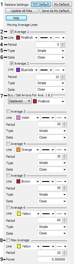 1. Restore Settings: TNT Default will change your settings back to the original software settings. My Default will change current settings to your personalized default settings. Apply To All Charts will apply your selected settings to all Moving Averages overlays on all open charts. Save As My Default will save your current personal settings.
2. Moving Average Toggle: Select to turn on each moving average line. There are 6 moving averages and a max moving average.
3. Line: Choose the color, line style, and line thickness of each of your moving averages lines.
4. Period: Indicates the number of bars to be used in the calculation of the moving average.
*To add an Offset, add a second number in the period box (with only a space between the two numbers, add a minus sign for negative displacement). This offsets the drawn moving average line forward or backward. It is not recommended to use offset when using Buy / Sell Arrows of the first 2 moving averages.
5. Type: Change the type of the Moving Average line to simple, linear weight, Hull or exponential. See under Calculation above for details about each of these types.
6. Data: Choose either open, high, low, or close as the data used in calculating the moving average.
7. Buy / Sell Arrows: Toggle Buy / Sell Arrows for the first 2 moving averages to either be displayed or not displayed. Choose the color of these arrows. See above under Buy / Sell signals for how these are calculated. It is not recommended to use offset of the first 2 moving averages when using these signals.
8. Toggle Max Average: This moving average has the customizable line and period but with no offset available and no Type or Data. To see how this is calculated look for Max Average in the Calculation Section above.
9. Max Average Power: Adjust the exponent that the max average calculation uses.
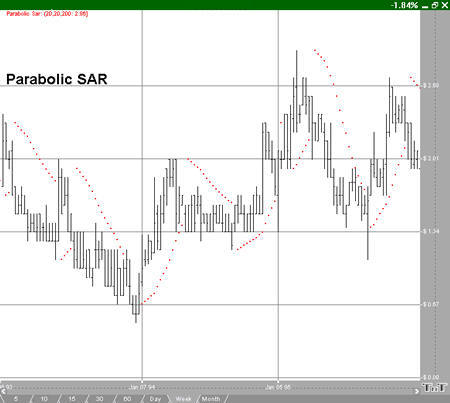
The Parabolic SAR, developed by Welles Wilder, creator of RSI and DMI, sets trailing price stops for either long or short positions. Also referred to as the stop-and-reversal indicator, Parabolic SAR is more popular for setting stops than for establishing direction or trend. Wilder recommended establishing the trend first, and then trading with Parabolic SAR in the direction of the trend. If the trend is up, but the underlying price drops back below the trailing PSAR indicator, then sell or liquidate your long position. If the trend is down, and the underlying price rises above the trailing PSAR indicator then buy or liquidate your short position.
Calculation
Once the market establishes a direction, the initial SAR becomes the extreme price for the two intervals. The extreme price is either the lowest price or highest price for the two trading intervals. The short position uses the high, and the long position uses the low.
The calculation for the PSAR is here:
SARt = SARt-1 + [ a x ( EPtrade - SARt-1) ]
SARt: The stop and reverse price for the current interval.
SARt-1: The stop and reverse price for the previous interval.
a: The acceleration factor.
EPtrade: The extreme price for the trade.
The SAR is always the “stop and reverse” price point. This is the point you would want to liquidate your current position and establish the opposite position.
The acceleration factor, a, is a weighting factor. In Wilder’s work, the initial value for the acceleration factor is .02. The acceleration factor increases by a value of .02 each time the extreme price changes for the trade. You do not increment the acceleration factor if the extreme price fails to change. The value for a, the acceleration factor, never exceeds .20 in Wilder’s methodology.
The extreme price (EP) for the trade is the highest or lowest price achieved during the trade. If you have a long position, use the new highs as the extreme price. When you have a short position, use the new lows as the extreme price. The extreme price concept allows for normal market corrections without immediately triggering the SAR price. It keeps the SAR price moving in the direction of the market.
To open the Parabolic Stop and Reversal Preferences click on the QuickLink (PSAR) in the lower right of the chart. Or you can right-click, select Overlay Properties and then Parabolic Stop and Reversal. If you click on the chart, the Preferences tab will go back to chart settings.
1. Restore Settings: TNT Default will change your settings back to the original software settings. My Default will change current settings to your personalized default settings. Apply To All Charts will apply your selected settings on all open charts. Save As My Default will save your current personal settings.
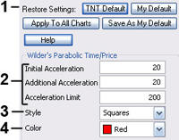 2. Initial, Additional, Limit: Specify the calculation number you would like each section of the indicator.
3. Style: Choose how you would like the indicator displayed. Select squares, crosses, dots, or lines.
4. Color: Select the color of the indicator.
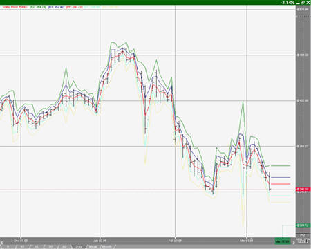
However, many traders believe that once one point is violated, the next point will be tested, making a violation of these support and resistance levels a clue in trend following. Though we cannot vouch for the truth of this statement, the popularity of pivot points amongst floor traders tends to make these points worth watching.
The use of pivot points varies greatly from trader to trader. The most common function of the daily pivot is as a guide. If prices are trading above the pivot point, then the trend is considered up. Traders may wish to take short-term positions on a violation of the daily pivot to the upside with an initial upside objective of the first resistance level. If prices stall or slow at the first resistance level, then aggressive traders may wish to take profits. However, if the first Resistance level is violated to the upside, then the market should go on to test the second resistance level. If prices have violated the 1st resistance level, then this level should act as support on future pullbacks, as should the pivot point.
The opposite is true for support levels. A violation of the daily pivot to the downside indicates that the daily trend is down, with a downside target being the first support level. If the market stalls, then traders may wish to take profits on short positions or initiate long positions in anticipation of a retracement to the daily pivot. However, if the first support level is violated, the day is said to be a strongly down trending day, and as such should move down further to test the second support level. As with the resistance numbers, the support numbers, once violated, become resistance lines to trade within the trend.
Though originally used as a means for floor trading, longer-term traders can use pivot points for longer periods. Try plotting the weekly pivot points on the daily chart and using it for shorter-term positioning on the daily charts. Pivot points can also be calculated using the monthly pivot points on the daily chart, and used for longer-term positions.
There are several methods used to determine the Pivot Point. We have included the three different formulas in Track 'n Trade 5.0.
Traditional formulas:
Pivot Point = (H + L + C)/3
First Support Line = (2 x Pivot Point) - H
First Resistance Line = (2 x Pivot Point) - L
Second Support Line = Pivot Point - (H - L)
Second Resistance Line = Pivot + (H - L)
Third Support Line = Low - 2*(High - Pivot)
Third Resistance Line = High + 2*(Pivot - Low)
Variation 1:
This method changes the formula used to derive the Pivot Point. The changes include adding the trading day's open and calculating the average of the four values. With this variation, one takes into account both opening gaps and overnight trading. The calculation is here:
Pivot Point = (H* + L* + C* + O**) / 4
*=Yesterday
**=Today
Variation 2:
This method changes the formula used to derive the Pivot Point as well. In this method, you substitute yesterday's close with today's open. Variation 2 also takes into account opening gaps and overnight trading. The calculation is here:
Pivot Point = (H* + L* + O**) / 3
Open the Preference tab from the Control Panel on the left of your screen. Select the Pivot Points on your screen. The preferences will appear in the Control Panel. (Once you click on the chart, the Preference tab will go back to chart settings.)
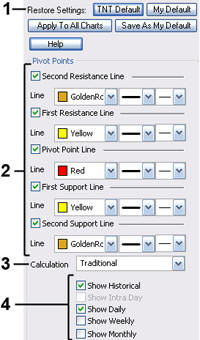 1. Restore Settings: TNT Default will change your settings back to the original software settings. My Default will change current settings to your personalized default settings. Apply To All Charts will apply your selected settings on all open charts. Save As My Default will save your current personal settings.
2. Pivot Points: Check the boxes to view different support and resistance lines. Change the color, style, and thickness of the lines.
3. Calculation: Select Traditional, Variation 1, or Variation 2.
4. Display Settings: Check to display Historical, Daily, Weekly, or Monthly pivot points. Select if you would like to see the Moving average line and enter the number of price bars you would like to be used to calculate it.
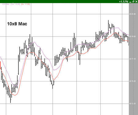
This system uses two simple moving averages, but they are calculated in a slightly different manner than those traditionally used. The first moving average is a moving average of the daily highs, as opposed to that of the daily settlement. The second moving average is calculated using the daily lows.
Though Mr. Bernstein recommends using a 10 period moving average of the daily highs and an 8 period moving average of the daily lows based on his observation that prices tend to fall about 20% faster than they rise, any combination would do the trick. Generally, accepting market lore that prices fall faster than they rise, the moving average of the lows should be of shorter-term duration than that of the highs.
The most basic use of the 10x8 Moving Average is to look for a breakout above the upper moving average to initiate a buy signal. When the daily settlement price exceeds the average high of the last 10 days, this indicator flashes a buy signal indicating that the trend of the market should be up.
Open the Preference tab from the Control Panel on the left of your screen. Select the 10x8 MAC line on your screen. The preferences will appear in the Control Panel. (Once you click on the chart, the Preference tab will go back to chart settings.)
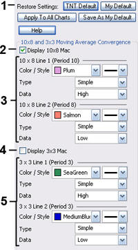 1. Restore Settings: TNT Default will change your settings back to the original software settings. My Default will change current settings to your personalized default settings. Apply To All Charts will apply your selected settings on all open charts. Save As My Default will save your current personal settings.
2. Display: Check the box to display the 10x8 MAC lines 1 and 2
3. 10x8 MAC Line: Change the color and style of the line. Also, change the type of the line from Simple, Linear Weight, or Extra Smoothed. Change the Data from Open, High, Low, or Close.
4. Display: Check the box to display the 3x3 MAC line.
5. 3x3 MAC Line: Change the color and style of the line. Also, change the type of the line from Simple, Linear Weight, or Extra Smoothed. Change the Data from Open, High, Low, or Close.
Knowing which exchanges open also gives insight into which currency pairs will be the most active. Pairs involving a currency of the exchange's country or region will see higher volume and increased liquidity while that particular market is open. For example, USDJPY and EURJPY will trade actively when the Tokyo exchange is open.
Note: An intraday chart must be open for the Time Zones indicator to be displayed.
Example of Time Zones
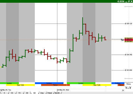
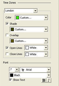
To open the Time Zones Preferences click on the QuickLink (TZone) in the lower right of the indicator window, below the indicator quick links. Time Zones is different as the different exchanges are displayed below the indicators. Or you can right-click, select Overlay Properties and then Time Zones. If you click on the chart, the Preference tab will go back to chart settings.
 Restore Settings: TNT Default will change your settings back to the original software settings. My Default will change current settings to your personalized default settings. Apply To All Charts will apply your selected settings on all open charts. Save As My Default will save your current personal settings.
Time Zones: Select a time zone from the dropdown list to customize its individual settings. Choose from London, New York, Sydney, and Tokyo.
Color: Specify the color of the lower time zone label.
Shade: Check the box to shade the time zone in the chart window, and specify the color.
Overlap: Check the box to shade the overlap between this and other time zones, and specify the color.
Open Lines: Check the box to display time zone opening times on the chart and specify
Close Lines: Check the box to display time zone closing times on the chart and specify the color.
Font: Specify the size, font, color, and style of the text.
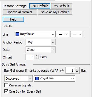
Volume Weighted Average Price (VWAP) is a technical analysis chart overlay used to measure the average price weighted by volume. VWAP is used with intraday charts as a way to determine the general direction of intraday prices. It's similar to a moving average in that when price is above VWAP, prices are rising and when price is below VWAP, prices are falling. VWAP is primarily used by technical analysts to identify market trend.
Calculation
The VWAP value is typically more sensitive to the impact as each bar’s new volume and price data is added into the calculation towards the beginning of the anchor period (i.e. trading session when set to Day) vs later in the trading session when the new volume and price data has less of an impact on overall cumulative volume weighted average price. When the Anchor Period is set to "Day" and where Data is set to "Close", the vwap value is built from the close and the volume traded, but is cumulatively building a volume weighted average price factoring in all trading activity up until that point from the start of that trading session..
For the above explanation:
Anchor Period drop-down set to "Day"
Data drop-down set to "Close"
Calculation
For settings example above, the value of VWAP for a given bar is calculated as follows:
Instead of using the close (c), the open (o) could be used, and you would end up with this (where o is used in place of c): VWAP = cumulativeOV / cumulativeV
Data could also be set to Average. Average is used in place of c and o, but the average has to be calculated also. The average is the average of the high, low and close. It could also be called the "typical price". It is calculated for a bar in the following manner:
average = (high + low + close / 3)
VWAP = cumulativeAV / cumulativeV
Anchor period may also be set to Weekly, which means that the VWAP value and data used to calculate it is reset every week to 0. In Futures, that reset occurs when the market closes for the week. For instance, that might be 4pm on Friday. When that happens, you'll notice that VWAP value is set to the "close" value for the bar right after the last bar when the market closed.
Anchor period may also be set to Custom. Setting it to Custom causes another box to appear where a number of bars can be entered. That number is the number of bars previous that can be used to calculate the VWAP for any given bar. For instance, setting the value to 13 bars indicates that the volume and the data for the previous 13 bars of each bar is used to calculate the VWAP value for each bar. The VWAP value is calculated using "rolling" values.
Choosing a Custom anchor period also causes a drop-down box to appear for "Resets". The box allows you to choose either "Daily, Weekly, or Never". Choosing Daily causes the VWAP value to reset again to zero, meaning also the volume and data used to calculate the VWAP value starts over again with the first bar of each day.
Basically, setting the value in the "Resets" drop-down to Daily or Weekly is similar to setting the value to "Daily" or "Weekly" in the Anchor Period box, except that it allows you customize the number of bars used calculate the VWAP value.
Selecting "Never" causes the values to never reset to 0, allowing the rolling VWAP value to use previous bars' data and volume to calculate the VWAP value for each new bar.
Preferences
Volume By Price is an overlay that shows the amount of volume for a certain price range. It is shown by horizontal bars based on the current data of the chart. The drawn bars span the price range, meaning that all volumes within that range are added to that bar. Chartists can use Volume By Price to provide support or resistance based on the high volume price ranges.
Volume By Price can be used as a support and resistance identifier. That is because larger volume at a certain price range shows higher interest in that price range. This interest can influence future supply and demand such that if the price goes to far away from the interest range then the price is likely to return to that range. Therefore, if an arrow is thrown by another indicator and the arrow is near a peak or valley in a low interest (low Volume By Price area) and the arrow points toward the higher interest price range then it can be said that the arrow is more likely accurate or supported.
Calculation
Volume By Price calculations are based on the Volume of the specified number of Price Bars back in the preferences. The Volume is considered at the Closing price of the bar. The volume at each price is then tallied up in the number of bars indicated in the Bar Height Scaling section of the preferences.
A Volume By Price bar is broken up into down volume (darker default color) and up volume (lighter default color). Up volume is when a price bar's price is greater than the open and down volume is when a price bar's close is less than the open.
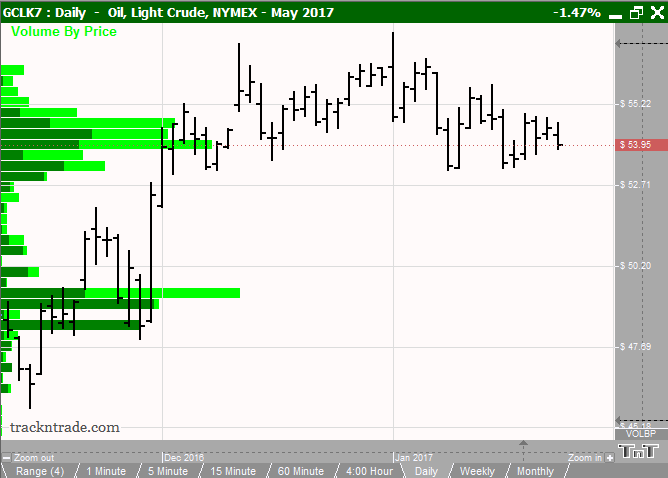
Example of Volume By Price overlay with the Volume indicator:
http://education.trackntrade.com/sites/education.trackntrade.com/files/i... [7]
Volume By Price Example
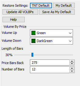
Preferences
Right-click anywhere on the chart and go to "Overlay Properties." Select Volume By Price from the list. The preferences will appear in the Control Panel. (Once you click on the chart, the Preference tab will go back to chart settings.)
http://education.trackntrade.com/sites/education.trackntrade.com/files/i... [8]
Restore Settings: TNT Default will change your settings back to the original software settings. My Default will change current settings to your personalized default settings. Update All VOLBPs will apply your selected settings on all open charts. Save As My Default will save your current personal settings.
Volume Up: This is the color of the up volume or the volume for which the close price is above the open price.
Volume Down: This is the color of the down volume or the volume for which the close price is lower than the open price.
Length of Bars: The length of the Volume By Price bars is the percent of the chart.
Price Bars Back: Chooses the number of price bars from the current bar to use
Number of Bars: Choose how many bars to display in the chart.
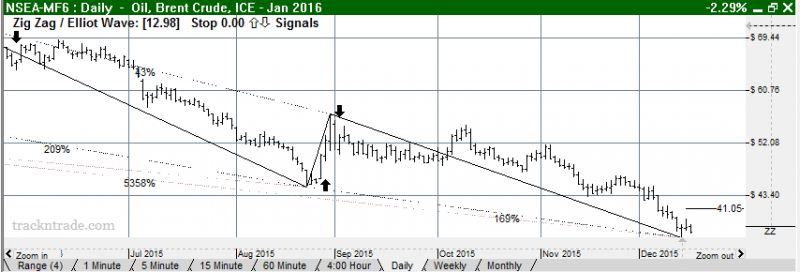
The Zig Zag Indicator acknowledges minimum price changes and ignores those that do not fit the criteria.
A Zig Zag set at 10% with OHLC bars would yield a line that only reverses after a change from high to low of 10% or greater. All movements less than 10% would be ignored. The value at the 10% is called the target of Zig Zag. If a commodity traded from a low of 100 to a high of 109, the Zig Zag would not draw a line because the move was less than 10%. If the stock advanced from a low of 100 to a high of 110, then the Zig Zag would draw a line from 100 to 110 because the target was reached. If the commodity continued on to a high of 112, this line would be extended to 112 (100 to 112). The Zig Zag would not reverse until the commodity declined 10% or more from its high. From a high of 112, a commodity would have to decline 11.2 points (or to a low of 100.8 the new target) for the Zig Zag to reverse and display another line.
Retracements are from zig zag high to high, or zig zag low to low. If Zig Zag retraces to a zig zag High, they are calculated from the movement from the previous zig zag low to the current high divided by the movement from the previous zig zag high to the previous low.
The Zig Zag indicator arrows are thrown when the market hits the target value. That means that a buy signal occurs when a valley is found by the market rising above the target value. That also means that a sell signal occurs when a peak is found when the market falls below the target value. In the example given that means the buy signal happened at 110 and the sell signal would happen at 100.8 if the market declined.
Zig Zag Example:
Once the Zig Zag is turned on right-click and go to 'Chart Overlay Preferences' and select Zig Zag. The Zig Zag preferences will appear in the Control Panel. (Once you click on the chart, the Preference tab will go back to chart settings.)
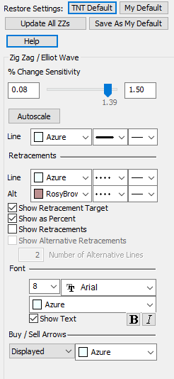 Restore Settings: TNT Default will change your settings back to the original software settings. My Default will change current settings to your personalized default settings. Apply To All Charts will apply your selected settings on all open charts. Save As My Default will save your current personal settings.
Change Sensitivity: Change the percent of calculation.
Autoscale: Select to autoscale Zig Zag for the chart you are viewing. Autoscale is activated automatically when first turning on the Zig Zag overlay in your chart.
Line: Choose the color, line style, and line thickness of your indicator line.
Line, Alt: Choose the color, line style, and line thickness of the retracement lines.
Show Retracement Target / Show as Percent, / Show Retracements / Show Alternative Retracements: to show percents, retracements, and alternative retracements.
Number of Alternative Lines: Enter the amount of alternative retracement lines you want to show on the chart.
Font: Select the font, size, and color of the text. You can also choose to bold or italicize.
Buy/Sell Arrows: Turns the display for buy/sell arrows on and off. You also have the option to change the color of the buy/sell arrows.
Links
[1] http://education.trackntrade.com/node/1309
[2] http://education.trackntrade.com/node/1307/
[3] http://education.trackntrade.com/node/1815/
[4] http://education.trackntrade.com/node/1806/
[5] http://education.trackntrade.com/node/1310/
[6] http://education.trackntrade.com/node/1284
[7] http://education.trackntrade.com/sites/education.trackntrade.com/files/imgs/live/VBPex.PNG
[8] http://education.trackntrade.com/sites/education.trackntrade.com/files/imgs/live/VOLBPpref.PNG